Difference between revisions of "MTS2:Creator Guidelines/Body Shop"
| Line 78: | Line 78: | ||
* For tutorials on adding textures, logos, and doing more than just a simple slider change, see: [[Tutorials:Body Shop Recolouring Tutorials]]. | * For tutorials on adding textures, logos, and doing more than just a simple slider change, see: [[Tutorials:Body Shop Recolouring Tutorials]]. | ||
<br style="clear:both" /> | <br style="clear:both" /> | ||
| + | |||
| + | |||
| + | ===Time and Effort=== | ||
| + | |||
| + | This is probably the hardest one to quantify, but it's something that is obvious whenever upload moderators look at an upload: have you really expended some serious time and effort on a creation? You can't just crank out a bunch of stuff in a short amount of time and expect it to be good. Nor can you spend a while just fiddling with something but not really trying and expect a good result either. | ||
| + | |||
| + | Most good creators spend hours upon hours on even simple creations. We understand that not everything has to be that difficult, but we do expect you to not just slap together something in 15 minutes and upload it and expect it to get accepted. Really try to put some serious effort into what you create, and it will show through in the quality. | ||
| Line 176: | Line 183: | ||
This is not an absolute -requirement- and for some things like historical clothing and the like you may do better with a simple basic set that matches your theme, and a nice garden scene can look nice too - just make sure that what you're doing in the background doesn't detract or distract from what you're actually uploading. | This is not an absolute -requirement- and for some things like historical clothing and the like you may do better with a simple basic set that matches your theme, and a nice garden scene can look nice too - just make sure that what you're doing in the background doesn't detract or distract from what you're actually uploading. | ||
| + | |||
| + | |||
| + | ===Inline/Attached Screenshots=== | ||
| + | |||
| + | When posting images that appear in the text of the thread (these are called inline screenshots), please make sure to limit these images to no larger than 800x600 pixels (so it doesn't create a horizontal scroll on the page for people on lower resolutions). | ||
| + | |||
| + | Please also do not post more than 4 inline screenshots - having a lot of images that have to load on the thread makes browsing downloads very slow and can make the thread jump around as they keep loading. | ||
| + | |||
| + | You may host your inline screenshots elsewhere like Photobucket.com - however, these screenshots hosted elsewhere must be additional screenshots, and you must make sure to actually attach your required screenshots to the thread itself. If your Photobucket account runs out of bandwidth or you delete the pics, people still need to be able to get the required screenshots on your thread. | ||
| + | |||
| + | You can attach up to 8 screenshots to the thread itself, with the 4 additional inline screenshots hosted elsewhere (or attached) for a total of 12 possible screenshots. This should be plenty to show what you've made, even for fairly large sets. Remember, you can always collage several different images together into one image if you have a bunch of stuff to show off, or want to show multiple angles of an outfit, or the like. | ||
| Line 274: | Line 292: | ||
| − | == | + | ==Checklist== |
| − | + | This is a checklist of everything gone over above so you can be sure you've done everything you need to do to ensure your submission is correct. This is just for your own use - checking these boxes doesn't actually -do- anything, just is an easy way to keep yourself organized. | |
| − | + | ===Quality=== | |
| − | + | <html> | |
| + | <input type="checkbox"><b>Highlights and Shadows</b> - Textures look realistically light and dark in the right places, and are not just a solid bucket fill.</input><br /> | ||
| + | <input type="checkbox"><b>Photoskinning</b> - If textures are from a photo, care has been taken to choose the right source images, and adjust it so the details are in the right place.</input><br /> | ||
| + | <input type="checkbox"><b>Not Too Bright</b> - If the creation is brightly-coloured or neon, the colours aren't truly neon in colour, but still look nice and bright in-game.</input><br /> | ||
| + | <input type="checkbox"><b>Black and White</b> - If any part of the creation is black or white, those areas are not true, pure black or white, but shades of light or dark grey.</input><br /> | ||
| + | <input type="checkbox"><b>Crisp/Unpixellated</b> - All textures look crisp and clear, with no blurriness or pixellation.</input><br /> | ||
| + | <input type="checkbox"><b>Bump Mapping</b> - If you've done bump mapping, it's not just a straight desaturation of the texture, but care has been taken to adjust it to bump in the right places. If you cannot view bump maps, you have instead filled the bump map texture with 50% grey, so people who can view them won't see wrong ones.</input><br /> | ||
| + | <input type="checkbox"><b>No Simple Slider Changes</b> - You've made an effort to create a nice new texture for your creation, rather than just slightly modifying an existing texture.</input><br /> | ||
| + | <input type="checkbox"><b>Time and Effort</b> - Have you spent a substantial amount of time and really tried to create something nice that is worth putting your name on?</input><br /> | ||
| + | </html> | ||
| − | + | ===Screenshots=== | |
| − | == | + | <html> |
| + | <input type="checkbox"><b>Big Enough</b> - Your screenshots are large enough to clearly see what you have made - limits are 1280x1024 pixels and 185 kbs.</input><br /> | ||
| + | <input type="checkbox"><b>In-Game</b> - Your screenshots are taken from within the game, and are not just pictures of your textures or taken from within Body Shop.</input><br /> | ||
| + | <input type="checkbox"><b>Poses</b> - You have posed your models in a way that best shows off what you have created - simple walking/standing poses work best. No twisty-torso model walk, please.</input><br /> | ||
| + | <input type="checkbox"><b>Show the Whole Thing</b> - Your screenshots show the entirety of what you have made - for clothing you haven't cropped out arms or feet but show the whole sim, head-to-toe.</input><br /> | ||
| + | <input type="checkbox"><b>Detail Pics</b> - If your textures have interesting details, you've zoomed in nice and close to show off those details with additional screenshots.</input><br /> | ||
| + | <input type="checkbox"><b>Close Enough</b> - You've shown your creation nice and close, so it fills pretty much the whole picture and can be clearly seen.</input><br /> | ||
| + | <input type="checkbox"><b>Multiple Angles</b> - For clothing, hair, and skintones, you have made sure to show the back and sides as well as the front.</input><br /> | ||
| + | <input type="checkbox"><b>Enough Light</b> - Screenshots taken outside are taken during daytime, with the sim facing the sun - or screenshots taken inside have the lights on, and enough of them so your creation is clearly visible.</input><br /> | ||
| + | <input type="checkbox"><b>All Items in Set</b> - If you are uploading a multi-item set, you have in-game screenshots of every item in the set - not just Body Shop pictures or texture swatches.</input><br /> | ||
| + | <input type="checkbox"><b>Obscured Skintones</b> - If you are uploading skintones, the crotches, breasts, and butt cracks are blurred or otherwise obscured.</input><br /> | ||
| + | </html> | ||
| + | |||
| + | ===Adult Content=== | ||
| − | + | ===Right Info/Right Files=== | |
Revision as of 04:48, 15 January 2008
Creator Guidelines - Body Shop
Uploading sim content? This guide will walk you through every step of what we require on MTS2. Please make sure you read these guidelines carefully, as our standards have changed over the years, and there may be some items you weren't aware of before.
At the end of the guidelines after full explanations of each item is a checklist, so you can make sure you've done everything you need to.
Quality
The first thing moderators look for when moderating uploads is quality - simply, is the item good or not?
Highlights and Shadows
Your textures should have some detail to them - not just a flat single-colour bucket fill, but with highlights and shadows in the right places, to give the appearance of folds, ripples, etc. - even fabric that would be skin-tight is going to have some shading and highlighting.- For a tutorial on a simple technique for adding shading and highlighting to a garment, see: How to Add Shadows and Highlights.
Photoskinning
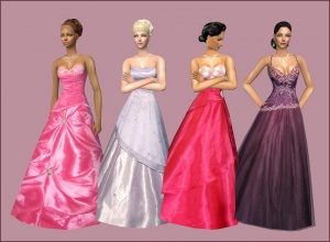
"Photoskinning" means using textures from a photograph to make an item. While photoskinning is a common practice, doing it well takes a lot of effort. You need to make sure you are using high-quality source images that aren't too small so that they get pixellated or blurry when you size them to your texture. You also usually can't just copy-paste the whole thing in one go and have it look right - you will need to cut the image into pieces to make sure things like seams, zippers, pockets, etc., end up in the right place on your garment. And you will need to make sure your source images are appropriate, too - a pair of jeans sort of rumpled and wrinkled up laying on a table will not photoskin properly into a pair of jeans on a sim.- For a basic tutorial on photoskinning, see: How to Make a Top Out of a Picture.
- For more tips on photoskinning, see this thread on MTS2: Photoskinning.
- And if you are using Photoshop, you may find that displacement mapping works better than Photoskinning: Beyond Photoskinning: Transformation and Displacement Mapping in Photoshop.
- For great examples of photoskinned clothing done well, see Bruno's Billowy Ballgowns (or pretty much any of the rest of Bruno's clothing - it's all excellent).
Not Too Bright
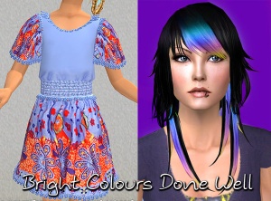
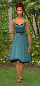
When creating an item that is brightly-coloured or neon, you need to keep in mind the way the game renders colour... Creating something that looks truly neon-bright in your graphics program will look blindingly bright in-game - as if it's actually illuminated, rather than just brightly-coloured. You can always turn down the saturation on your texture if it's looking too bright.- For good examples of neon textures done well, not too bright (the ones used in our example pics to the right), see: Bright Summer Dress for Sim Girls (Jasana_Bugbreeder) and 13 Alternative Colours of Myos Hair 12 (Anva).
Black and White
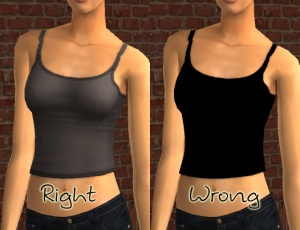
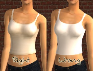
When making something that's black or white, you never use -actual- true black or white. For black you use dark grey, and for white you use light grey. That way you can still add lighter or darker for shadows and highlights, and your item will look right in the game - true black just looks like a dark hole, and true white is far too bright.- For tips on making black and white clothing look right in-game (including suggested settings), see: Tiptorial: Making Black and White Clothing the Right Way.
Crisp/Unpixellated
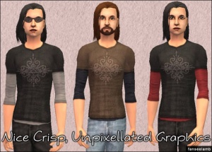
You need to make sure, also, that your textures are crisp and clear. There shouldn't be any blurriness or pixellation to your textures. They should look as clear and crisp as Maxis textures. If you're using an image for texturing (photoskinning or otherwise), make sure you're not scaling up your image - if it's a logo or design, you should have to shrink it to fit on your texture, not make it bigger.- If you find your textures are nice and crisp in your graphics program but suddenly look blurry in Body Shop, that's likely a problem with Body Shop's settings. See here for information on fixing that: Game Help:Blurry Body Shop Projects
- If your textures are nice and crisp in your graphics program and Body Shop, but they look blurry in-game (and everything else does too) that's probably your game's graphics settings. In the game, under options (...), in graphic options (monitor icon) turn Texture Detail up to High and click Apply Changes.
Bump Mapping
If you're not aware of what the term "bump mapping" means, or if you don't know if you can view bump maps in your game, first, see here: Game Help:Bump Maps and Shaders. There are also instructions there on enabling bump maps if you don't have them.Simply put, bump maps are a way for the game to add the appearance of dimension to your textures even when those parts aren't actually 3D. Well-done bump maps can add a nice detail to buttons, hems, edges, belts, zippers, sweater textures, etc.
However, you cannot rely on bump maps to add detail - your textures should look good without bump maps. Bear in mind that many people cannot view bump maps, so if your textures don't look good without them, your creation will not look good for a vast number of people. Also keep in mind that it's better to have no bump maps at all than to have badly done ones.
If you cannot view bump maps, you need to remove them from your creation - do a bucket fill of 50% grey (RGB value 128.128.128) in the bump map texture to create a neutral bump map (no bump map).
- For more tips on bump maps and doing them right, see this tiptorial: Tiptorial: Bump Maps
No Simple Slider Changes
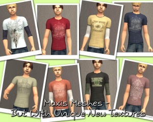
If you're going to make something for sims, don't just grab a Maxis texture and change the colour on it - making a slightly paler Maxis skin, for instance, or making a blue shirt green, or inverting the colours on a texture. This is something that anyone can do, and really isn't worth uploading. Take the time to create a unique texture, add some new details, and make it something worth uploading (and downloading).- For tutorials on adding textures, logos, and doing more than just a simple slider change, see: Tutorials:Body Shop Recolouring Tutorials.
Time and Effort
This is probably the hardest one to quantify, but it's something that is obvious whenever upload moderators look at an upload: have you really expended some serious time and effort on a creation? You can't just crank out a bunch of stuff in a short amount of time and expect it to be good. Nor can you spend a while just fiddling with something but not really trying and expect a good result either.
Most good creators spend hours upon hours on even simple creations. We understand that not everything has to be that difficult, but we do expect you to not just slap together something in 15 minutes and upload it and expect it to get accepted. Really try to put some serious effort into what you create, and it will show through in the quality.
Screenshots
People want to see what they're downloading! Your screenshots sell your upload - if people don't like the look of your screenshots, they're not going to download - and if your screenshots are too bad, you won't get your upload approved.
All of the screenshot images below can be clicked for larger versions. You wouldn't want to upload them with as small of pics as are displaying here anyway - we're just using smaller pics so this thread loads quickly and is easy to read.
Screenshot Basics
For instructions on:
- Taking large, clear pictures (bigger than the game will allow)
- Changing your in-game settings for best graphics quality
- Camera controls
See: Screenshot Basics
You need to make sure you have nice big, clear pictures that show off what you've made. They can't be too blurry or pixellated, and you need to know how to use the game's camera controls properly, so make sure you review the information on that link thoroughly before continuing.
Big Enough
Your pics should be large enough to see the detail of what you've made. Remember, MTS2 allows images up to 1280x1024 pixels and 185 kilobytes so you should be able to upload nice big, pictures, without having them too small. See the information above under "Screenshot Basics" for info on taking larger pics than the game will normally allow.
And please don't take smaller pics and just make them larger in your graphics program - this just gives you a blurry pic that's bigger in dimensions with no additional detail.
In-Game
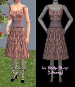
In order to see what your creation looks like in-game, we require in-game screenshots. You must actually load the game and take your screenshots there. We do not accept Body Shop pics, texture pics, SimPose, 3D program pics, etc., without the required in-game pics too. Please don't try to cut out backgrounds or fake in-game pics. We can definitely tell the difference.For best results, put your item on a sim on a lot. Create-a-Sim screenshots are acceptable, but the lighting in CAS is pretty bright and you may not be able to get detail pics and that sort of thing, too.
Poses
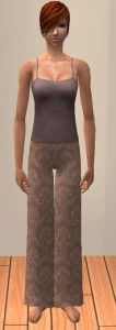
If you are uploading clothing, your sims need to be in a pose that shows off your clothing properly. The best way to do this is simply to have your sim stand there, doing nothing, arms at their sides. You can also just have your sim walk normally - click "go here" and have them walk.Please don't use that twisty-torso model walk as it distorts the sim's body, or model-type poses that really don't show what you've made very well. It may be artistic and interesting for contests and the like, but remember, you're showing off your creation, not the sim or your posing skills.
Show the Whole Thing
Make sure that your screenshots show the whole item - for clothing or skins, this needs to be a head-to-toe shot. Don't crop or leave out important details like hands, feet, etc., even if you haven't done anything with them - people want to know that the cute bathing suit they're downloading doesn't have heels, for instance.You CAN use cropped or closer pictures to show detail and/or for your thumbnail shot, but make sure you have at least one pic that shows everything.
Detail Pics
For an upload with special details that cannot be clearly seen from a full-body shot, it's a good idea to show detail pics. You can get some nice close-up shots this way that really show the interesting bits. Make sure these are in addition to (not instead of) your full body shot.
Close Enough
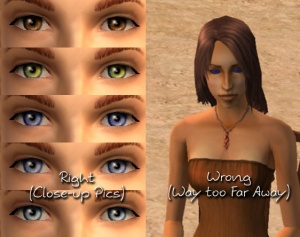
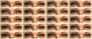
Take your pics from close up! Don't take your pics from across the lot or far away - this won't show what you've made. Get nice and close, on the same level as the sim.For things like makeup and eyes, this is especially important! You want to make sure people have a very clear idea of what they're getting, so you can't take your pics from too far away or your creation simply won't be visible.
Multiple Angles
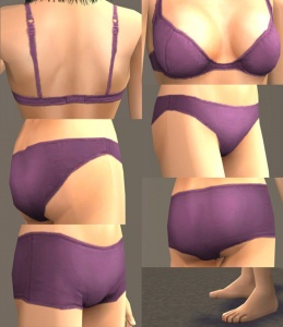
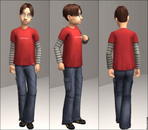
Especially with things like clothing, skintones, or hair, it can be very helpful to not only show the item from the front, but also the sides and the back. People downloading want to know that what they're downloading doesn't just look good from one angle, but from all sides.
Enough Light
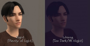
Don't take your pics at night or in a dark room! Take your sim outside in the sunlight (make sure they're facing the sun - light comes from a certain direction on the lot!) or put them in a well-lit room. At the same time, make sure you don't use too much light: Create-a-Sim screenshots can sometimes be too bright to show things like freckles on a light skintone, or if you put a sim in something light-coloured under a bright light, it can wash out and lose a lot of the detail of what you've made.
All Items in Set
If you are uploading a set of items with multiple colours or styles, you must include in-game screenshots of every item in the set! You can't just upload a single in-game pic and then show the other colours it comes in, or texture swatches - you need to have actual in-game pics of everything! It may be time-consuming to take pictures of a large set, but it gives downloaders a much better idea of what they're getting.
Obscured Skintones
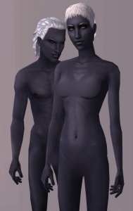
Because MTS2 is not an adult site, you need to take special care when uploading skintone files. Not only must your skintones not have too much "adult" detail on the actual skins themselves (please see the special note below under "Adult Content/Nudity" regarding skintones) but you must obscure your screenshots.This means you need to cover the female breasts, the crotches on both genders, and the butt crack of both genders. You may do this by putting your sims in skimpy underwear, by covering those areas in a black bar, or, probably the best way to do so without your obscuring getting in the way of your texturing, selecting those areas in your graphics program of choice and applying a blur or pixellation filter to them.
Try Neutral Backgrounds
For best results, use a simple plain backdrop for your screenshots. While it may be tempting to do a really complex set, what you're showing in your screenshots is what you're uploading, and something simple and plain is the best way to show off what you've made. If you're uploading something mostly dark-coloured, make sure to use a light backdrop (and vice versa - darker backdrop for light stuff) so it doesn't get lost in the background.
This is not an absolute -requirement- and for some things like historical clothing and the like you may do better with a simple basic set that matches your theme, and a nice garden scene can look nice too - just make sure that what you're doing in the background doesn't detract or distract from what you're actually uploading.
Inline/Attached Screenshots
When posting images that appear in the text of the thread (these are called inline screenshots), please make sure to limit these images to no larger than 800x600 pixels (so it doesn't create a horizontal scroll on the page for people on lower resolutions).
Please also do not post more than 4 inline screenshots - having a lot of images that have to load on the thread makes browsing downloads very slow and can make the thread jump around as they keep loading.
You may host your inline screenshots elsewhere like Photobucket.com - however, these screenshots hosted elsewhere must be additional screenshots, and you must make sure to actually attach your required screenshots to the thread itself. If your Photobucket account runs out of bandwidth or you delete the pics, people still need to be able to get the required screenshots on your thread.
You can attach up to 8 screenshots to the thread itself, with the 4 additional inline screenshots hosted elsewhere (or attached) for a total of 12 possible screenshots. This should be plenty to show what you've made, even for fairly large sets. Remember, you can always collage several different images together into one image if you have a bunch of stuff to show off, or want to show multiple angles of an outfit, or the like.
No Pay Content
Do not use pay content in your screenshots! Do not use pay hair in your screenshots!
You MUST use free or Maxis hair in your screenshots! MTS2 promotes and supports free content, and using pay content in screenshots is basically like free advertisement for paysites. This includes pay content you found elsewhere for free - if it was pay originally, it's still promoting pay content.
As of 21 July 2007, MTS2 no longer allows the use of pay content in screenshots. For sim content uploads, this includes (but is not limited to) hairstyles. You must use free or Maxis hairstyles on your models! Do not use pay or donation hairstyles on your models when uploading here. For more information, please see the Site News article on the subject.
MTS2 has an extensive collection of free hairstyles in our Downloads section, and you can look in the Sims2Wiki Hair Gallery for more free hairstyles. You'll be able to find something you like.
Adult Content/Nudity
MTS2 is not an adult site. We do have an adult site affiliated with MTS2, Sexy Sims 2 where adult content may be uploaded. But because MTS2 is a PG-13 site, no adult content may be uploaded to MTS2 itself.
Skintones
Skintones uploaded to MTS2 must be completely "barbie" below the waist. That is, you cannot include genitals or pubic hair for either gender. Skintones uploaded to MTS2 may include female nipples, or you may leave them off if you prefer, for a Maxis-like skintone that is completely "barbie."
You must obscure your skintones even if they are completely "barbie." Please see the section above under Screenshots, ("Obscured Skintones") for exact details on what you must obscure, and how to do so.
Other Adult Content
Content with swear/curse words or sexually suggestive themes may not be uploaded to MTS2. Please upload these items to the adult site instead.
Items relating to illegal drugs do not belong on MTS2. You -may- post items relating to prescription and over-the-counter drugs, as well as alcohol and tobacco on MTS2, but items related to illegal drugs should go on our adult site.
"Nude clothing" uploads are not allowed on MTS2 - that sort of thing needs to go on the adult site.
For more information and a further list of items we do not allow on MTS2, see: Uploads Not Allowed on MTS2.
Right Info/Right Files
Once you have your creation made and screenshots taken, you need to make sure you have all the fiddly bits in order.
Right Files
All Body Shop Content must be uploaded from your "Saved Sims" folder - not your "Projects" folder. Files from your Projects folder are unfinished and will not work properly.
Do not upload files from your "Projects" folder!
The correct files are in "My Documents/EA Games/The Sims 2/SavedSims" and will be called something like 83edf5a_YourProjectName.package, where the first part is a randomly generated string, and the "YourProjectName" part is what you called your project when you made it in Body Shop. You can rename your files to be something more descriptive (they'll still work renamed) but please do not delete the ".package" extension. This extension is required for the game to find your files.
ZIP or RAR
You will need to put your .package file(s) into a RAR or ZIP file to upload here. Please see here for instructions on doing so.
Meshes Needed/Included?
Do you need a mesh? If you are recolouring a hair, clothing, or accessory, downloaders may need a custom mesh for your content to work right. If you don't know whether a custom mesh is required, it's very easy to check: cut and paste the contents of your Downloads folder somewhere else temporarily. Then put in only your creation, and load the game or Body Shop. If it shows up correctly, you don't need a custom mesh. If it doesn't show up correctly and shows a Maxis default instead, you do need a custom mesh, and you'll need to figure out what one it is. This can be tricky if you have a lot of meshes - best way is to make sure you know what mesh you're recolouring before you ever start!
Including Meshes: If your creation does require a custom mesh, you may wish to include it in your upload so that downloaders can just get what you've uploaded and not have to go anywhere else.
Once you've identified what mesh it is, you need to check back with the original creator on their site or forum and see what they say about that - look for a FAQ or policies page to see what they have to say about including their meshes. They may not want you to include their mesh, or they may only be okay with it if you include their readme file as well.
Please do not include meshes that are uploaded on MTS2, even if the creator says it's okay - this creates redundant uploads.
Do not include meshes that the creator says not to include, or if the creator doesn't say. If you get special permission to include a mesh that normally cannot be included (or the creator's policies don't say anything) please say in the text of your upload post that you have permission - we can't read your mind!
If you do include the mesh, make sure you include a credit and link in the text of your post!
Linking to Meshes: If you cannot include a mesh, or the mesh is hosted on MTS2, link to the mesh in the appropriate spot when uploading - when you mark your upload as a New Mesh Recolour you will get a screen asking you to link to the mesh. Please give as direct a link as possible - to the page where the mesh is, if you can. If you cannot give a direct link, or if there are a lot of meshes on the page, please give directions in the text of your post, as clear as possible... i.e. "Look under Female, Adult, Everyday, then go to Page 4, and download the black dress with the blue belt outfit - the mesh is included with it."
Expansion/Stuff Packs Required?
Certain meshes are included with expansion packs, and your creation will not work for users who do not own that expansion pack. The easiest way to identify this is to go into the game, into Create a Sim, and look at the expansion/stuff pack icons on the original outfit/hair/accessory. Body Shop does include these icons as well, but they only seem to show up intermittently.
Make sure you only mark the EPs/SPs required that your upload actually needs!
For Seasons outerwear, it will require Seasons and any other EP/SP the original mesh is from. If you have Pets, make sure you patch your game (get the Pets patch!) so that your creations won't require Pets.
Permission/Credit
If you are not starting completely from scratch or editing Maxis items, you MUST give credit for what you use made by other people. This means if you use someone else's mesh, textures, alphas, or bump maps (in whole or in part) you must credit them. You can't just edit whatever you like. In addition, you'll need to check the original creator's policies to make sure they allow you to do so - if they say you can't, or they don't say one way or the other, you will have to ask permission and wait for a "yes" reply before you post your work. If they say "no" or don't reply, you can't post it!
Make sure that you post a credit and a link back to the original creator, and if you got permission, you need to mention it! (i.e. "Thanks to Soandso from http://www.randomsimsite.com for giving me permission to edit their original textures.") We know many creators require permission but can't know you've gotten it if you don't say so.
You can and will be warned for stealing content if you use someone else's work without permission/credit, so if you don't remember where you got something or can't get permission, go the safe route and make it yourself or find something you can edit.
Good Title
You'll need a good title for your upload - something descriptive... like, "Long Gold Dress" or "Realistic Skintone - 4 Colours!" is good. Something non-descriptive like, "My First Upload!" is not.
Good Description
You'll need to write up a little basic description of what your upload is... you don't have to get too fancy, but you do need to write something to get people interested. For instance, "This long gold dress with gold bracelet and high heels is perfect for a night out on the town." Something like, "This is my first upload... I don't know what to put here..." really doesn't make it sound like you've put any effort into it - and will reflect poorly on your creation. You don't have to write a novel, just something that makes it sound like it's worth taking a closer look at.
Checklist
This is a checklist of everything gone over above so you can be sure you've done everything you need to do to ensure your submission is correct. This is just for your own use - checking these boxes doesn't actually -do- anything, just is an easy way to keep yourself organized.
Quality
Highlights and Shadows - Textures look realistically light and dark in the right places, and are not just a solid bucket fill.
Photoskinning - If textures are from a photo, care has been taken to choose the right source images, and adjust it so the details are in the right place.
Not Too Bright - If the creation is brightly-coloured or neon, the colours aren't truly neon in colour, but still look nice and bright in-game.
Black and White - If any part of the creation is black or white, those areas are not true, pure black or white, but shades of light or dark grey.
Crisp/Unpixellated - All textures look crisp and clear, with no blurriness or pixellation.
Bump Mapping - If you've done bump mapping, it's not just a straight desaturation of the texture, but care has been taken to adjust it to bump in the right places. If you cannot view bump maps, you have instead filled the bump map texture with 50% grey, so people who can view them won't see wrong ones.
No Simple Slider Changes - You've made an effort to create a nice new texture for your creation, rather than just slightly modifying an existing texture.
Time and Effort - Have you spent a substantial amount of time and really tried to create something nice that is worth putting your name on?
Screenshots
Big Enough - Your screenshots are large enough to clearly see what you have made - limits are 1280x1024 pixels and 185 kbs.
In-Game - Your screenshots are taken from within the game, and are not just pictures of your textures or taken from within Body Shop.
Poses - You have posed your models in a way that best shows off what you have created - simple walking/standing poses work best. No twisty-torso model walk, please.
Show the Whole Thing - Your screenshots show the entirety of what you have made - for clothing you haven't cropped out arms or feet but show the whole sim, head-to-toe.
Detail Pics - If your textures have interesting details, you've zoomed in nice and close to show off those details with additional screenshots.
Close Enough - You've shown your creation nice and close, so it fills pretty much the whole picture and can be clearly seen.
Multiple Angles - For clothing, hair, and skintones, you have made sure to show the back and sides as well as the front.
Enough Light - Screenshots taken outside are taken during daytime, with the sim facing the sun - or screenshots taken inside have the lights on, and enough of them so your creation is clearly visible.
All Items in Set - If you are uploading a multi-item set, you have in-game screenshots of every item in the set - not just Body Shop pictures or texture swatches.
Obscured Skintones - If you are uploading skintones, the crotches, breasts, and butt cracks are blurred or otherwise obscured.
