CAS Picture Taking Tutorial
| Tutorials by Category | |
|---|---|
|
CAS | Patterns | Objects | Building | Worlds | Modding | Modding Reference |
Contents |
CAS picture taking tutorial
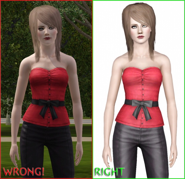
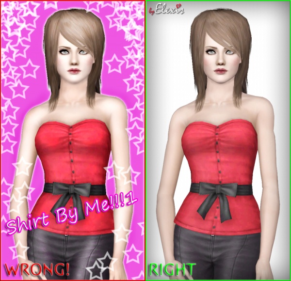
Clean and nicely done pictures will help present your uploads at their best; bad screenshots can make even the fairly good CC look bad, so it’s very important that you spend some time and effort in order to present your uploads nicely. This tutorial will explain all “RIGHT’s” and “WRONG’s” in simple steps with example pictures, so everyone will be able to see the difference themselves. Most of the steps are explained in Creator Guidelines and are required for uploading on Mod The Sims, and some of them are purely optional (advices).
Though it is written for CAS stuff, it still can be useful for showcasing other things, like poses or objects.
Difficulty
This tutorial is written for beginners, but some basic knowledge on how to use cheats and “Tab” camera mode is required.
Let’s get started
For this tutorial, I will use my “Summer Breeze” top as an example CAS part that should be showcased for upload.
Game settings
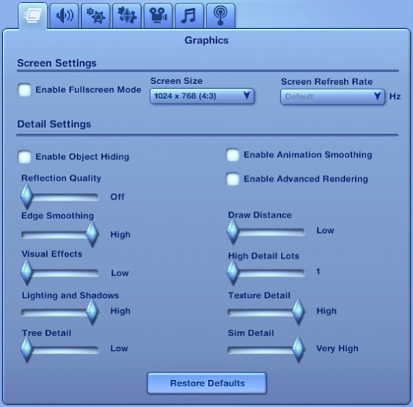
First, make sure that your PC can handle the game on high “Sim Detail” and “Texture Detail” settings; there is totally no use to show CAS stuff on low settings as everything will look blurry and poorly made.
You can turn off all other settings that do not affect how Sim will look, but I highly recommend to set your settings at least like shown in the screenshot below.
In-game pictures only
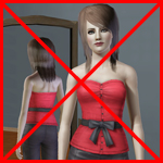
Second most important rule – no CAS, CTU or TSRW pictures! All screenshots must be taken IN-GAME, during the normal gameplay. I repeat - no CAS pictures! You have been warned.
We all know that Create-a-Sim window uses very heavy lighting and it makes everything look different than in the actual gameplay, so you will need to take all required pictures in-game in order to upload your stuff on MTS.
In addition, CAS pictures make your post look scruffy.
“C” key for taking pictures
Sims 3's default picture taking button - the „C“ key takes big and clear screenshots, so you don’t need to use “Print Screen” key or “Fraps”. Pressing “C” on your keyboard or clicking the little camera icon on the menu panel will do nicely.
You can find the screenshots in My Documents/ Electronic Arts/ The Sims 3/ Screenshots folder.
No daylight pictures
Sunlight shadows look horrible in Sims 3 - they create unrealistic and heavily shaded edges on your Sim, leaving the black eyeballs with spooky white dots.
Don’t take your pictures outside, build a closed room instead – put your Sim in it and place lots of lights around. Use “TestingCheatsEnabled True” and “Buydebug” cheats to unlock new buy mode section where you will find some useful lights which will become invisible in live mode. Place them around the Sim and you will have the perfect lighting.
Neutral backgrounds
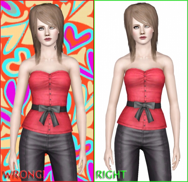
It’s always tempting to make a pretty and colorful background, but for upload pictures you need to use a neutral pattern and toned down colors, otherwise your showcased item will be lost in all those colors. Not to mention – bright colors can be eye hurting, so make sure that no one will be needing sunglasses while looking at your pictures.
Place your Sim against a plain wall, other objects or Sims shouldn’t be visible in the background! It’s not nice when you can see the dirty toilet somewhere on your picture when you are presenting, for example, a designer dress…
Avoid showing off plumbobs, thought bubbles and relationship status icons - they look very unprofessional.
Right angles
Use “Tab” Cameraman mode to make your pictures! The default in-game camera has very limited possibilities – you will not be able to get the needed angle, or zoom in enough without using Tab mode.
- Take all pictures in Sim-height view, not from above or player’s perspective!
- Zoom in enough to see the texture details – it’s better to make bigger screenshots and then resize them, than to take small ones without resizing. This trick saves tons of image quality.
- Show your item from different angles. Full height, front view, back view or side view are required.
- Do not leave an empty space on your picture, cropping it out you will reduce the file size and increase the quality when saving! Combine a few shots in to collage if needed.
Good poses
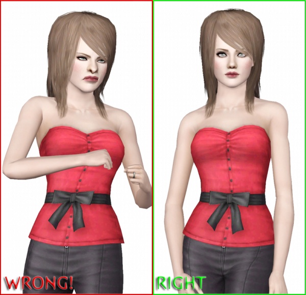
It may look cute and funny if you take your pictures with Sims jumping, stretching, dancing or doing any other activity, but it is not a good way to make pictures for uploads. Some animations in Sims 3 can make your mesh or texture look stretched and jagged and some people can think that there is something wrong with your showcased item.
Use neutral idle animations (or poses, if you use Pose Player) – walking, standing or other movement that do not include many bent joints. Avoid poses and animations which have hands and other body parts blocking the view of your item – for example, hands that will cover clothing.
Showing the presets
Creator Guidelines require showing your item in more than one color preset – this means, that using totally different patterns and colors for your presets is the best way to showcase it.
Make sure that you show at least one preset with neutral pattern and color! Light gray or toned down white color without any patterns will do – it will keep the texture details clearly visible.
Don’t use any color at full opacity, don’t use totally black or white colors – use the color and brightness slider only up to about 90%, not more.
Less is more
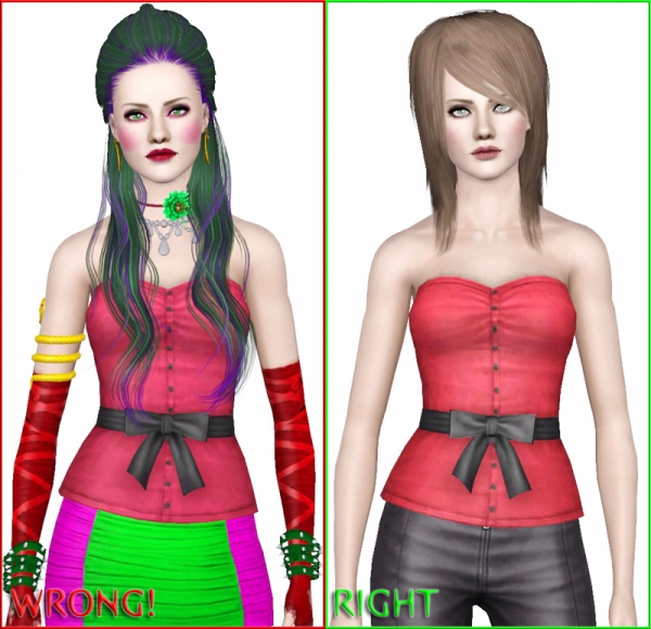
Lots of nice and shiny custom content can make your pictures look pretty – but not for uploads! The showcased item can be lost in the bunch of “shiny-pretties”; it is not good when people need to spend 5 minutes to find your item in that bunch of stuff. Your main task should be highlight what is truly important – your item.
This means you should get rid of all unneeded custom content for your pictures and make sure that nothing blocks the view of your item.
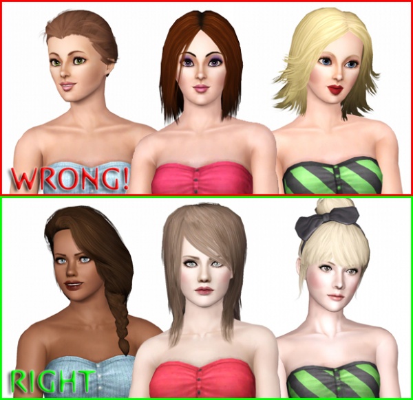
Remove long hairs that are hiding the clothing - use short or tied hair instead. Do no use bright colored makeup and accessories, your pictures will look nicer without them.
Right models (optional)
We are all tired of boring and unrealistic EA Sims faces – big eyes, small noses, round eyebrows, pre-made smiles and ugly super-thin jaws will not add more attractiveness and realism to your models and your pictures in general, so use custom Sims (created yourself or downloaded from MTS).
Different face shapes, body types and skin colors will help to see how versatile your upload is, so don’t be lazy and “hire” some nice Sim models :)
Photoshopping
No matter how tempting it is to use some shiny Photoshop filters – just don’t do it!. Over contrasted, blurred, sharpened or otherwise altered pictures aren’t good for anyone’s eyes.
Simple border, faded out background edges and simple logo that doesn’t cover your creation is more than enough, but all that is purely optional.
Picture size and formatting
Randomly sized pictures with poorly cropped edges don’t look nice. What makes the upload post neat is the right picture formatting. All pictures must be the same size and style - it makes easier to view them in the gallery. Make sure that your picture size is within required MTS limits – minimum 800x600 pixels and maximum 1280x1024 pixels.
Square (150x150 pixels) image for thumbnail should be neat and representative enough to get the idea of what you are uploading even without opening the actual post.
Last, but not least – clean and neat upload post. Good and descriptive title, short description, ages/genders/categories information, coloring options, poly count and other information should be listed clearly.
| Tutorials by Category | |
|---|---|
|
CAS | Patterns | Objects | Building | Worlds | Modding | Modding Reference |
