Difference between revisions of "MTS2:Creator Guidelines/Sims 3 Poses"
| Line 23: | Line 23: | ||
! style="text-align:left" | Pose the whole body (*) | ! style="text-align:left" | Pose the whole body (*) | ||
|- | |- | ||
| − | | | + | |Always try to alter every or at least almost every joint a little bit. Altering just a few joints doesn't make a natural pose. Also avoid perfect symmetry. Even if you make a standing pose, you should alter the legs and feet and rotate the torso a bit to create a natural pose. Begin with the big changes and work your way down to the details. Don't forget to pose the hands and fingers as they count a great deal to the final quality of your pose. It's difficult, but try to alter the face as well to create some facial expression. |
<br style="clear:both" /> | <br style="clear:both" /> | ||
|} | |} | ||
| Line 47: | Line 47: | ||
! style="text-align:left" | No sinking or floating (*) | ! style="text-align:left" | No sinking or floating (*) | ||
|- | |- | ||
| − | |Whether the sim is standing on their feet or sitting on their butt or whatever you can think of, always make sure that whatever the sim is resting on actually touches the ground. Touch as in not visibly | + | |Whether the sim is standing on their feet or sitting on their butt or whatever you can think of, always make sure that whatever the sim is resting on actually touches the ground. Touch as in not visibly float above it or sink into it. If you use an OMSP to make a sim sit on a stool or lie on a bed, make sure that the height of the OMSP perfectly matches the height of the surface. |
<br style="clear:both" /> | <br style="clear:both" /> | ||
|} | |} | ||
| Line 55: | Line 55: | ||
! style="text-align:left" | No stretching or compressing (*) | ! style="text-align:left" | No stretching or compressing (*) | ||
|- | |- | ||
| − | |So, you | + | |So, you altered joints on that pose all day and now that foot is floating above the ground a bit? Don't give in to the temptation to just stretch the leg! Always keep all the bones at their regular length. We've seen all the stretched toddlers we ever wanted to see. Stretched or compressed skeletons aren't useful and stopped being funny a long time ago. |
<blockquote> | <blockquote> | ||
'''Tip: Never move a joint! Just rotate them.''' | '''Tip: Never move a joint! Just rotate them.''' | ||
Revision as of 23:02, 6 May 2011
Contents |
Sims 3 Poses
Introduction
Made stunning poses that you just HAVE to share? Please read the following guidelines carefully so you know what we expect for uploading your poses to MTS.
Quality/General
This is by far the most important factor in pose uploads, but also the hardest to quantify.
| Time and effort |
|---|
| Most good creators spend hours upon hours on even simple creations. We understand that not everything has to be that difficult, but we do expect you to not just slap together something in 15 minutes and upload it and expect it to get accepted. Really try to put some serious effort into what you create, and it will show through in the quality.
This is probably the hardest one to quantify, but it's something that is obvious whenever upload moderators look at an upload: have you really expended some serious time and effort on a creation? You can't just crank out a bunch of stuff in a short amount of time and expect it to be good. Nor can you spend a while just fiddling with something but not really trying and expect a good result either. |
| Upload sets of poses (*) |
|---|
| Single poses will almost always not meet the Creator Guidelines in terms of time and effort. As a rule of thumb, your upload should at least contain 4-5 poses to be approvable to begin with.
|
| Pose the whole body (*) |
|---|
| Always try to alter every or at least almost every joint a little bit. Altering just a few joints doesn't make a natural pose. Also avoid perfect symmetry. Even if you make a standing pose, you should alter the legs and feet and rotate the torso a bit to create a natural pose. Begin with the big changes and work your way down to the details. Don't forget to pose the hands and fingers as they count a great deal to the final quality of your pose. It's difficult, but try to alter the face as well to create some facial expression.
|
| Stick with what's anatomically possible (*) |
|---|
|
|
| Don't defy gravity (*) |
|---|
|
|
| No sinking or floating (*) |
|---|
| Whether the sim is standing on their feet or sitting on their butt or whatever you can think of, always make sure that whatever the sim is resting on actually touches the ground. Touch as in not visibly float above it or sink into it. If you use an OMSP to make a sim sit on a stool or lie on a bed, make sure that the height of the OMSP perfectly matches the height of the surface.
|
| No stretching or compressing (*) |
|---|
So, you altered joints on that pose all day and now that foot is floating above the ground a bit? Don't give in to the temptation to just stretch the leg! Always keep all the bones at their regular length. We've seen all the stretched toddlers we ever wanted to see. Stretched or compressed skeletons aren't useful and stopped being funny a long time ago.
Tip: Never move a joint! Just rotate them.
|
| No clipping and no anti-clipping (*) |
|---|
| Always triple-check that there is little to no clipping, i.e. as little clipping as possible. On the other hand, if parts of the body are supposed to make contact, e.g. hand on hip, they should actually make contact and not miss each other by a foot. If a sim is supposed to have their hand resting on their knee, make sure the hand is actually resting on the knee and not going right through the knee joint or hovering way above the knee.
|
Screenshots
People want to see what they're downloading! Your screenshots sell your upload - if people don't like the look of your screenshots, they're not going to download - and if your screenshots are too bad, you won't get your upload approved.
| Big Enough |
|---|
The larger your pics, the better! Tiny pics won't show enough detail to see what you've made.
Please don't just take a small pic and size it up in your graphics program to get bigger pics - this only makes the dimensions larger but doesn't add any detail and just gives you a blurry, pixellated larger pic, not a nice clear one. |
| Well-lit |
|---|
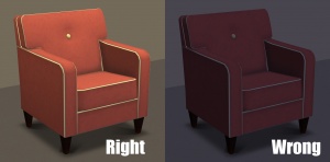
| Make sure you take your pictures during the daytime in bright sunlight, in a well-lit room, etc., - make sure your screenshots are nice and bright enough that people can see what you've made. Nighttime shots or those in a dark room really don't show off your creation very much.
At the same time, make sure you don't use too much light: if you put light-coloured item under a bright light, it can wash out and lose a lot of the detail of what you've made.
|
| Good angle |
|---|
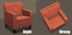
| Remember to take your screenshots at an angle that shows off what you've made. Screenshots taken from a "sim's eye view" generally work best, while pictures taken from a high overhead or "player's eye view" tend to not show your creation very well. Remember, you can always take multiple pictures to show your item from different angles.
|
| Show the whole thing |
|---|
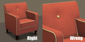
| Make sure that your screenshots show the whole item, top to bottom, left to right. Your item should be centered in the image, with nothing cut off the edges.
You CAN use cropped or closer pictures to show detail and/or for your thumbnail shot, but make sure you have at least one pic that shows everything.
|
| Close enough |
|---|
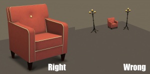
| Take your pics from close up! Don't take your pics from across the lot or far away - this won't show what you've made. Get nice and close, on the same level as a sim.
|
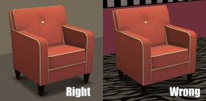
| Try neutral backgrounds |
|---|
| For best results, use a simple plain backdrop for your screenshots. While it may be tempting to do a really complex set, what you're showing in your screenshots is what you're uploading, and something simple and plain is the best way to show off what you've made. If you're uploading something mostly dark-coloured, make sure to use a light backdrop (and vice versa - darker backdrop for light stuff) so it doesn't get lost in the background.
This is not an absolute -requirement- and for some things like historical furniture and the like you may do better with a simple basic set that matches your theme - just make sure that what you're doing in the background doesn't detract or distract from what you're actually uploading. Remember that your upload should showcase what -you- have made, so if you pack a room with decorations, it may not be obvious at a glance what it is you've actually created!
|
| Maximum Number of Inline/attached screenshots |
|---|
You may now upload up to 100 pics! Of course, please keep it to a reasonable quantity... only things like huge sets, full worlds, etc. should have that many pics! Remember, you can always collage several different images together into one image if you have a bunch of stuff to show off, or want to show multiple angles of an item. For the bonus photos, we recommend you use a spoiler tag to hide the images, then people can click on it to see them. Their pages will load faster if all the images aren't downloading at once. [spoiler=interior rooms]http:// wheveremypictureis/picture.jpg[/spoiler] The 'interior rooms' can be replaced by whatever grouping you want to present, 'hidden garden', 'pool views', 'master suite', 'kids room', etc. You may place as many photos within a spoiler grouping as you'd like.
|
| No pay content in screenshots |
|---|
| Do not use pay content in your screenshots! Do not use pay hair in your screenshots!
You MUST use free or EA/Maxis items in your screenshots! MTS promotes and supports free content, and using pay content in screenshots is basically like free advertisement for paysites. This includes pay content you found elsewhere for free - if it was pay originally, it's still promoting pay content. We strongly recommend taking pics with neutral backgrounds, just showing off what you've made and nothing more. Not only does this look nicer for uploads, it also eliminates any possibility that you may inadvertently include pay items in your screenshots. As per the news item of November 2010, do not use pay items in your upload. A pay item is an item that you'd have to donate money to access if you went to the original creator's website. It doesn't matter if you can get it for free through a file sharing site - it's still a pay item. Don't use pay items in your screenshots either, even if they are not included. Links for "optional" or "recommended" content may be included as long as they are free sites only. If you need free hair for a model in your pics, MTS has an extensive collection of free hairstyles in our Downloads section. You can also look in the TS2 Hair Gallery or TS3 Hair Gallery for more free hairstyles to find something you'll like. We STRONGLY recommend that you credit the hair (and other content) used in your screenshots in the text of your upload post. With hundreds of hairstyles out there, it's very difficult for our upload moderators to know every hairstyle on sight, and if we have to hunt down where the hair is from to see if it's pay or free, it may take longer for your upload to be approved. Make it easy on us and at least say something like, "Hair from XM Sims (free)" in the text of your post under a little section for model credits.
|
| Screenshot tips |
|---|
| Camera Controls:
Take some time to just play around with the camera. It can take a while to get used to the camera controls, and even once you are experienced in their use, it may be challenging to get the shot you want with the constraints on the controls. If you haven't taken many sim pictures before, here is a list of camera controls:
Using Print Screen: If you have enough RAM to run Photoshop or another graphics editing program at the same time as TS2/TS3, you may want to take screenshots yourself, without the use of a program to store them for you. To do that, simply press the Print Screen or PrntScn key on your keyboard - it's usually off toward the right, over the arrow keys, above Insert and Delete. This will copy your current screen to your Windows clipboard, as if you had selected and copied it as an image. Then open any graphics editing program, create a new document the size of your monitor's resolution, and paste into that document. Your screenshot should appear in the document.
There are many programs available, free and pay, that will take screenshots for you by using a hotkey, and save them to a folder - just like The Sims 2 with the C key, but with options for much better quality settings. A quick Google search for 'free screenshot program' will also bring up many other options, which may have other features that are of interest to you.
Many simmers struggle with getting their images to be clear, crisp and under the maximum file size while keeping the image size larger than 800px by 600px. After getting your images from the in game camera or using a print screen program you will need to resize them and compress them into a jpeg image. Many graphics programs have a built in optimizing feature. Here are a few common ones: |
| Add the pose names to your screenshots (*) |
|---|
| Please add the pose name as text to the screenshot so downloaders see what pose it's actually showing. Make sure your text is in blank areas of the picture or covers an absolute minimum of your creation.
|
| No Photoshopping on required screenshots (*) |
|---|
| While it can be tempting to get artistic with your screenshots in Photoshop, please don't. Screenshots need to be just as things look in the game, with no extra filtering such as contrast, sharpen, blur, saturation, etc.
|
| Clothes and hair can't cover the poses (*) |
|---|
| So this long hair and that dress you downloaded the other hair are absolutely stunning? Sorry, but a pose upload is probably not the best place to show them off. It must always be recognizable where under the clothes and hair the sim and the skeleton is.
|
Required Screenshots
You always need to show all poses that come with your upload. Beyond that the screenshots need to meet certain requirements.
| Show the arms and legs (*) |
|---|
| Make sure that your screenshots show where the arms and legs are in relation to the torso and how and at what angle they are bent.
|
| Show the hands (*) |
|---|
| Hand and finger positions and angles are very important for a good pose. Make sure that they can be seen on your screenshots.
|
| Show the face (*) |
|---|
| Make sure that the facial expression of the posed sim is visible so folks can see whether the sim is frowning of smiling. Yes, posing the face is difficult and maybe you only altered it a little bit or even used the neutral default face without altering it. Still, downloaders must be able to see the facial expression of the poses.
|
| Show a pose from two angles if one isn't enough (*) |
|---|
| If you're struggling to make that one single screenshot that shows a pose in all its glorious detail, why not just make two screenshots from different angles? While one screenshot may be enough to show off a pose, it's never wrong to make two.
Sometimes you may even need to show a pose from two angles to fullfill the requirements.
|
Additional Stuff
- If your upload is rejected or marked as changes required and you're not sure why, ask in Creator Issues.
- If you're not sure whether your poses are ready for uploading, use the Creator Feedback Forum to get feedback on it.
